
What Should Bridesmaids Wear?
I’m going to be straight with you: most of what’s written about bridesmaid dresses online is useless. Chiffon flows beautifully! Consider your bridesmaids’ body shapes! Start early!
You know this already.
What you probably don’t know is how it actually feels to stand in a room and watch a bridal party walk in. What reads as a group. What makes six people look like they belong together without looking like a uniform. What makes someone look like themselves rather than a dress that happened to be on them.
I’ve shot well over a hundred weddings. I’ve watched sage green look electric in one venue and completely wrong in another. I’ve watched mismatched bridesmaids look effortlessly individual and chaotic in the same shot. I’ve watched simple choices look stunning twenty years from now and trendy ones already look dated.
Here’s what I’ve actually learned.
Colours That Photograph Well (and a Few That Don’t)
The colours that consistently look beautiful in photos are the ones with some depth to them. Dusty rose, sage green, terracotta, navy, burnt orange, soft burgundy. They hold detail, they work in both colour and black and white, and they tend to complement natural light rather than fight it.
The ones that cause problems:
Pure white or very pale ivory. In direct outdoor light, white blows out. Detail disappears. If your bridesmaids are in white and you’re shooting outside on a bright day, that’s a real problem. Champagne or blush is almost always a better call.
Neon or very saturated tones. Bright coral, electric blue, vivid yellow. They draw the eye away from everything else in the frame, and in candid shots they tend to dominate in a way that feels unbalanced.
Very dark colours in bright outdoor light. A deep navy or forest green can look stunning in shade or golden hour. In harsh midday sun it collapses to near-black and loses all texture.
None of this means avoid these colours entirely. It means talk to your photographer about your venue, your lighting, and your timeline.

What Photographs Well in Black and White
A lot of my work is black and white, so I think about this differently to most photographers.
In black and white, colour becomes tone. A pale sage green and a dusty rose that look completely different in colour can become almost identical tones in mono. What matters is contrast — not between the colours themselves, but between light and dark.
A group where everyone is in a similar mid-tone shade can look flat in black and white. A group with a mix of lighter and darker tones, or where the bridesmaids contrast clearly against the background, gives me something to work with.
If you’re working with a documentary photographer who shoots a lot of mono, ask them about this specifically. It’s worth thirty seconds of conversation.
Fabrics: What Moves and What Doesn’t
Chiffon and lightweight crepe are what most photographers quietly hope for. They move. In candid shots — walking, laughing, dancing — movement in fabric is what separates a beautiful image from a static one. The dress does some of the work for you.
Satin can be beautiful but catches light in ways that are harder to manage. Sequins and beading are even more so — in direct flash or harsh sun they create hotspots that are difficult to expose around.
For the end of the night dancing shots: lighter, floatier fabrics photograph much better than structured heavy ones. Something to keep in mind if those shots matter to you.
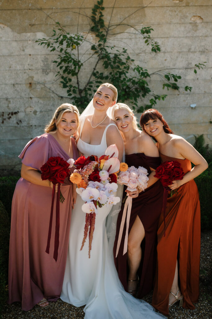
Matching vs. Mismatched
The honest answer: matching is easier to photograph as a group. Same colour, same silhouette — I can place six people, get the composition right, and the image reads cleanly.
Mismatched is more interesting as a concept and often looks better in individual shots. Six different dresses means six different people rather than a uniform. But it does make group shots harder to compose, and if everyone has a different style and a different colour, it can read as chaotic rather than intentional.
If you’re going mismatched, having one unifying element — same colour, different cuts, or same fabric, different colours — gives me something to anchor the shot on.
The Things Nobody Tells You
Sashes and belts tend to date photographs more than anything else. That wide satin belt at the waist looks current now. In ten years it will look like ten years ago.
Accessories compete. Six bridesmaids each wearing statement earrings, a bracelet, a necklace, and a belt is six people fighting for visual attention. Simpler tends to age better and photograph better.
Shoes matter more than you’d think. Not for the formal shots — you won’t see them. But at the end of the night when shoes come off and everyone’s barefoot on the dance floor, that’s when the best photos happen. Nobody cares what the shoes cost.

What This Actually Means for Your Wedding
None of this is a rule. I’ve shot weddings where the bridesmaids wore yellow jumpsuits and it was brilliant. I’ve shot a full black-tie wedding where the bridesmaids wore charity shop dresses they picked themselves and the photos were some of my favourites.
The point is to make an intentional choice rather than a default one. Know why you’re picking what you’re picking. If it’s because it feels right for the day and the people wearing it, that’s exactly the right reason.
If you want to talk through your specific venue, timeline, and what I’d suggest given those, get in touch. It’s not a sales call — I just find this stuff genuinely interesting.


